
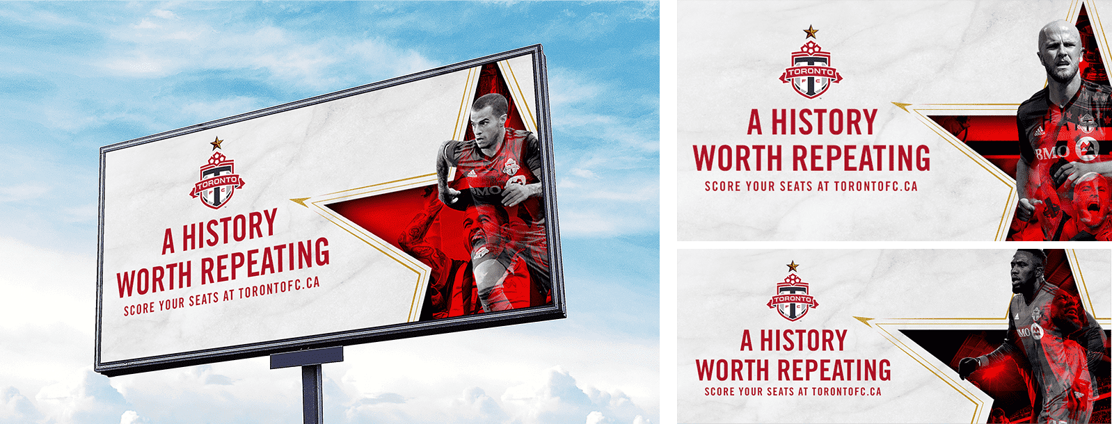
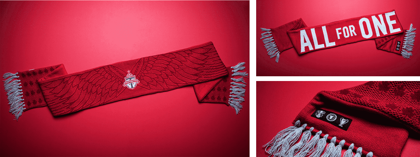
TFC SEASON LOOK & FEEL 2018/2019
Client: Maple Leaf Sports & Entertainment
ROLE
TFC won the MLS Cup in 2018. I helped create the look and feel for their 2018/2019. It went live on digital billboards across Toronto, as well as all their digital and social plays. I also designed and did the illustration on the scarf that would go in to the member package, which was distributed to over 20,000 of their season ticket holders.
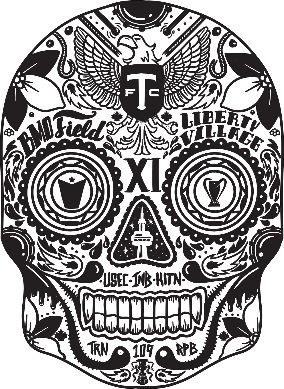
2017/2018 TFC FINALS SKULL
Client: Maple Leaf Sports & Entertainment
ROLE
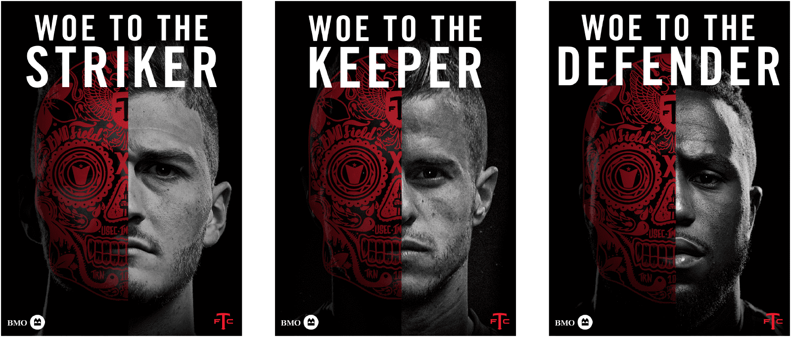
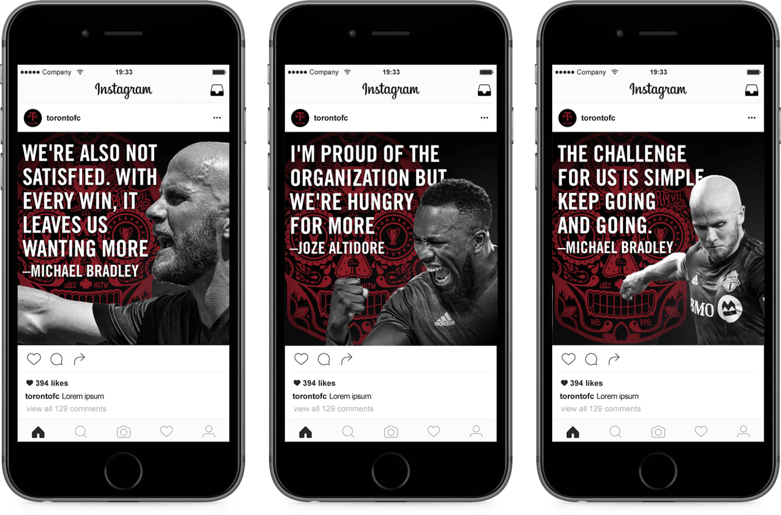
In the 2017/2018 season for TFC, they were hungry. They lost the finals in the MLS Cup the year before, and they wanted to prove that they could take it all. In turn, I was asked to illustrate a sugar skull that consists of everything TFC stands for. The skull was to intimidate the opposition. It was to be used in social and digital executions. It was then animated in the final match for the MLS Cup.
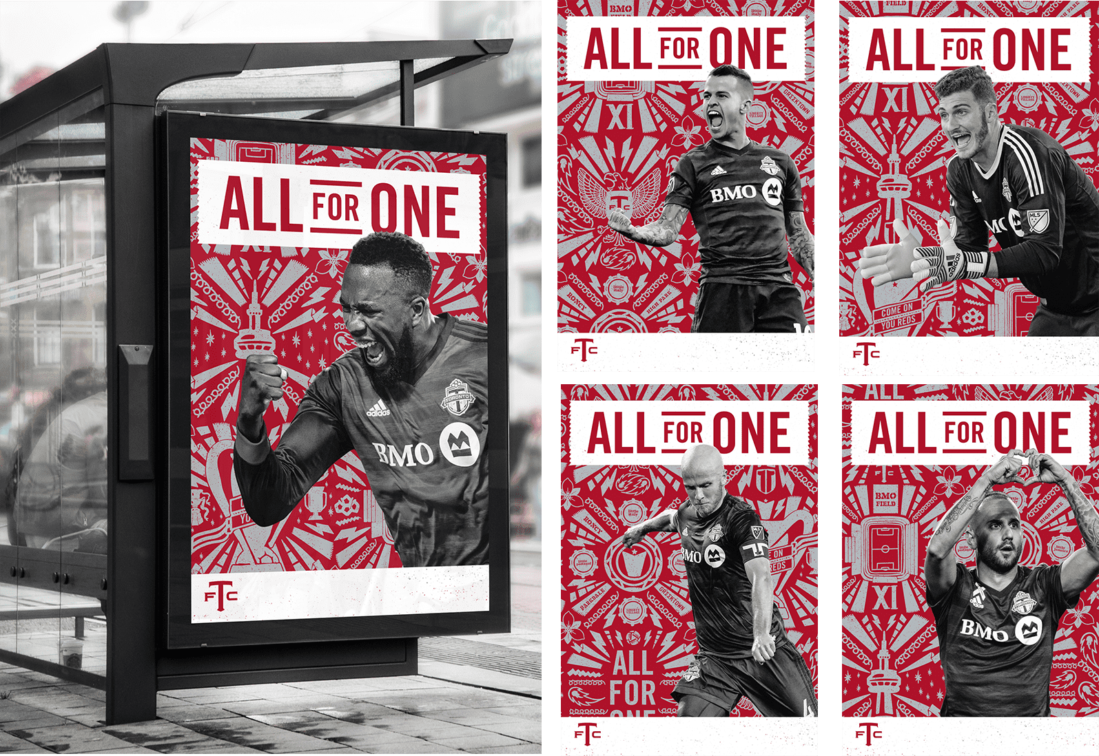
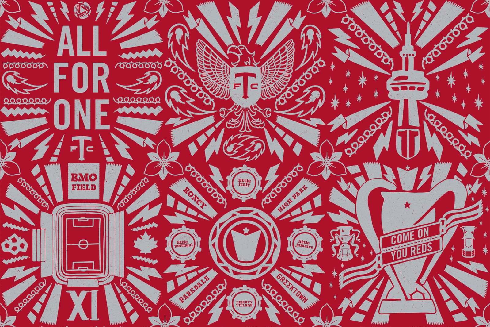
TFC 2017/2018 FINALS CREATIVE
Client: Maple Leaf Sports & Entertainment
ROLE
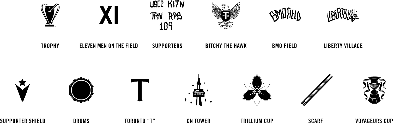
This was the primary finals creative that was used for the 2017/2018 season. It lived on transit shelters, billboards, and all print assets for the rest of the finals. I illustrated the repeating background pattern that consisted of 6 panels of everything that TFC stood for – their motto, their history, their city, their battlefield, their people, and their accomplishments.